The definitive guide to designing mobile surveys

According to Pew Research (1) a majority of U.S. consumers own multiple digital devices (desktop/laptop computer, tablet, and smartphone) and they seamlessly move from one platform to another as a part of their everyday lives. It is common for consumers to start an online shopping experience on a mobile phone, then finish the transaction on a PC for instance.
Today’s cross platform culture means consumers use a variety of devices for accessing your online survey. Depending on the sample source and target, estimates range anywhere from 30-60% percent of all survey takers are using a smartphone or tablet to access a survey (2). While researchers are familiar with designing a survey for the PC device, how do we also optimize the survey experience for the mobile users? The screen sizes and input methods for each of the devices are unique, and these differences must be accounted for in order to render the best possible survey taking experience for the participant no matter what device they use to take the survey. With the dramatic real-estate limitations on a mobile phone and the reduction in attention-spans overall, mobile survey takers, in particular, are more susceptible to primacy effects, satisficing (engaging in behaviors that allow them to quickly complete a survey rather than give careful consideration to the question), and survey dropout (3, 4).
There has been much research over the years—to address issues of data quality, data consistency, and respondent engagement— especially with regards to understanding best practices for mobile survey design (5-6). What follows is an attempt to synthesize our current understanding and provide a list of guidelines to make online surveys accessible and optimized for today’s multi-device consumer.
Mobile first design “Similarity”
Content that is easy to read and use on a desktop screen does not necessarily work on a mobile screen. But content designed and sized to fit on a smartphone can, in most cases, be accommodated on the desktop screen. This is due to the larger desktop screen, which offers more room to reasonably display more content within the viewable area, compared to the smaller mobile screen. Therefore, as a rule of thumb, when thinking about online survey design, start with the lowest common denominator. For most studies, that is the smartphone. Then from there, build out your survey for the remaining devices (e.g. tablet and desktop).
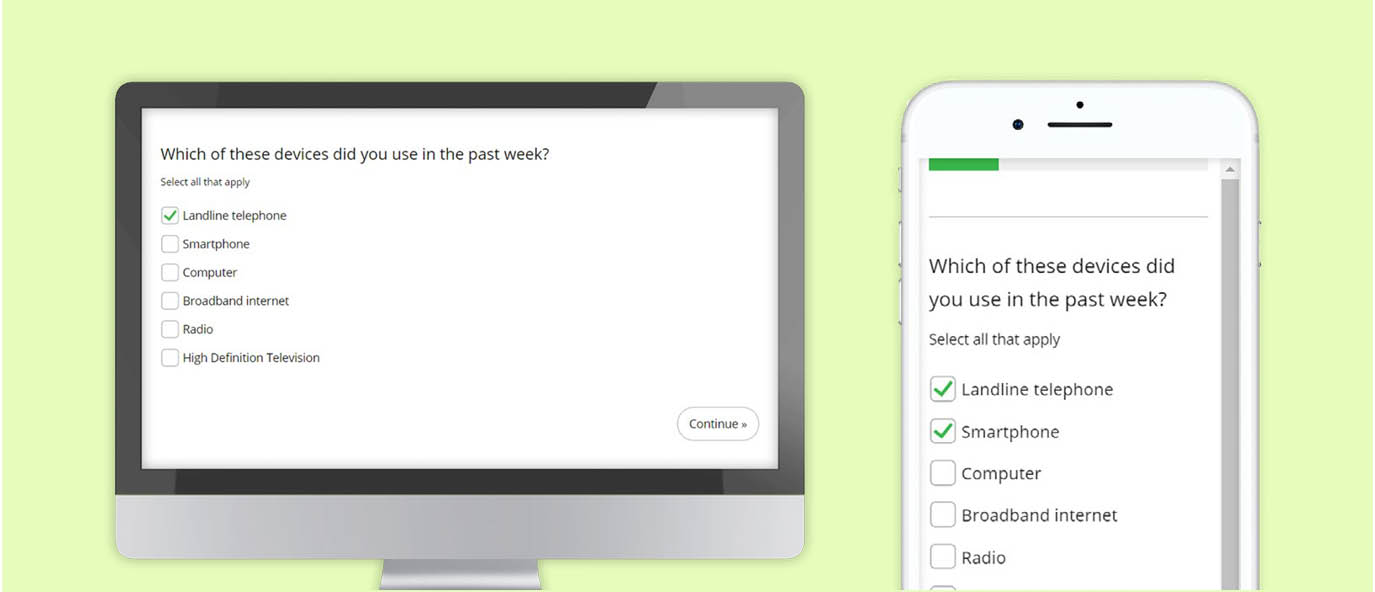
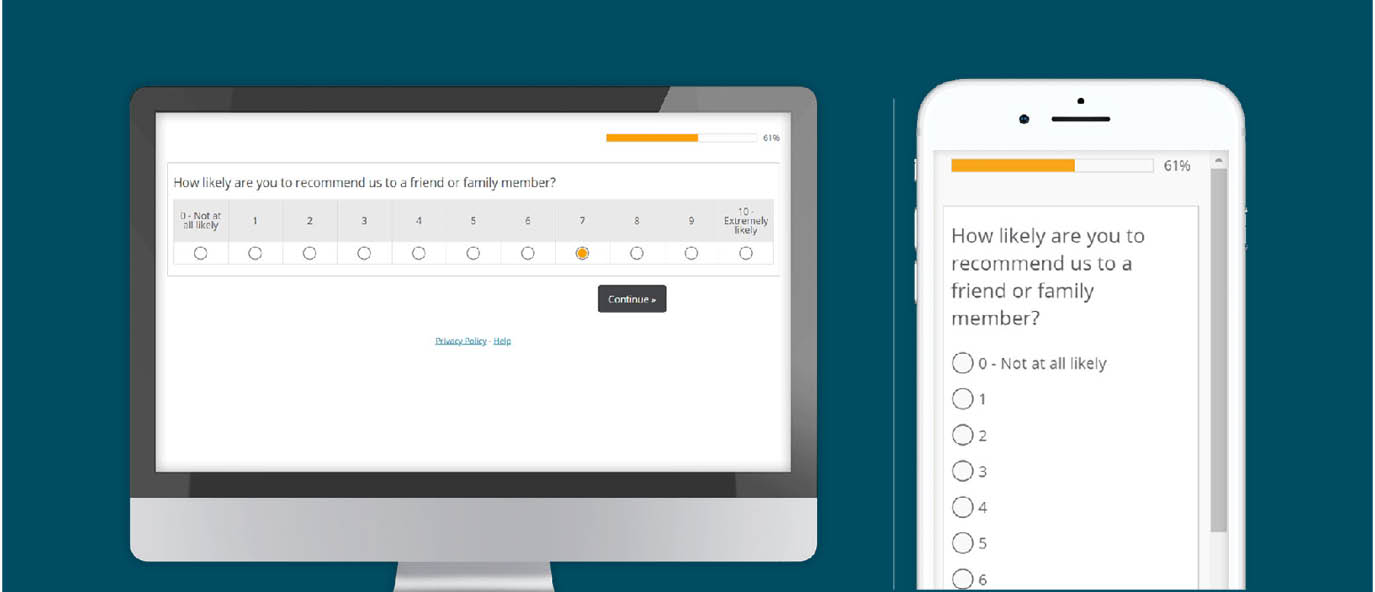
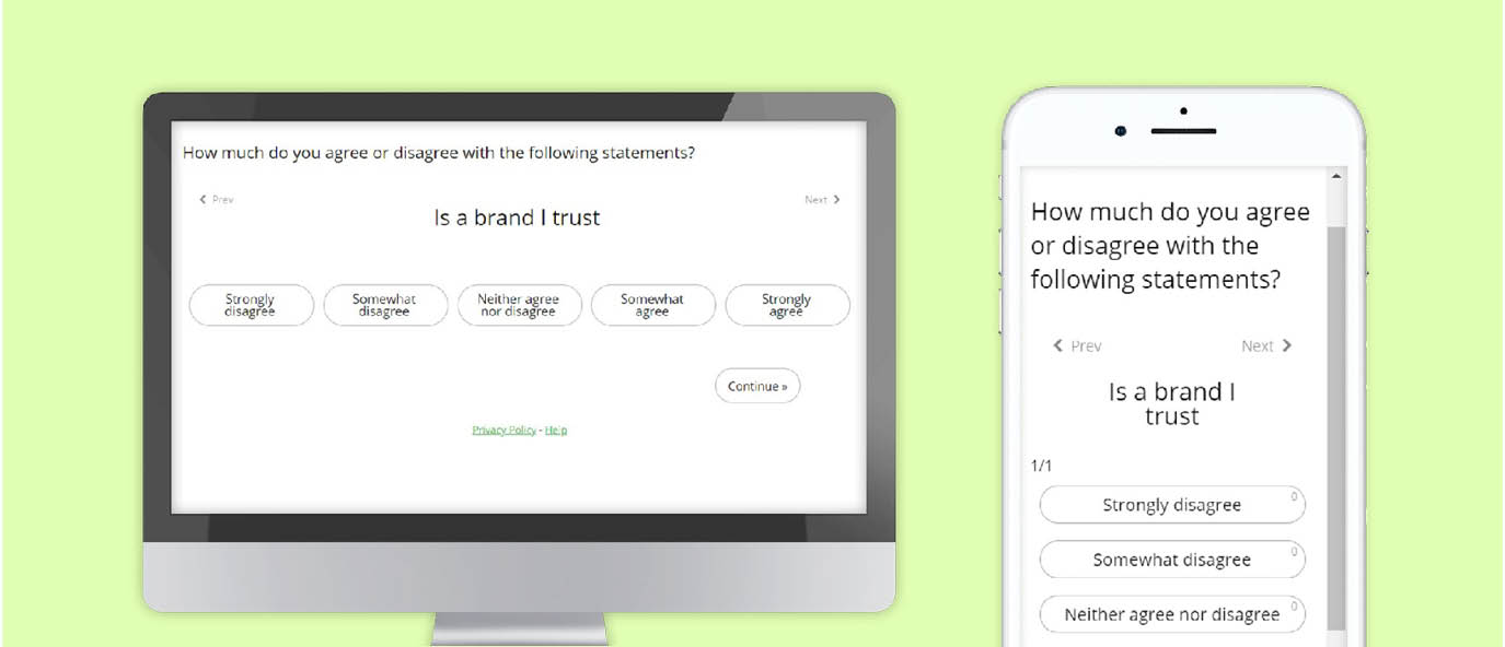
Aim for design similarity among devices. This will help preserve data consistency among the different devices. This means keeping the fundamental structure of the question and input requirement to be generally the same, no matter if the survey is taken on a desktop, tablet or smartphone device. However it doesn’t need to be exact and the priority should be to follow best design practice for the given device (7). Cosmetic differences between devices, such as color and spacing won’t have an impact. But altering the scale order will. Using a radio button form on a desktop will yield the same results as a button select form on a mobile device, since a point and click task is generally the same as a touch event. But it is not the same as a drag and drop event.
Five general principles
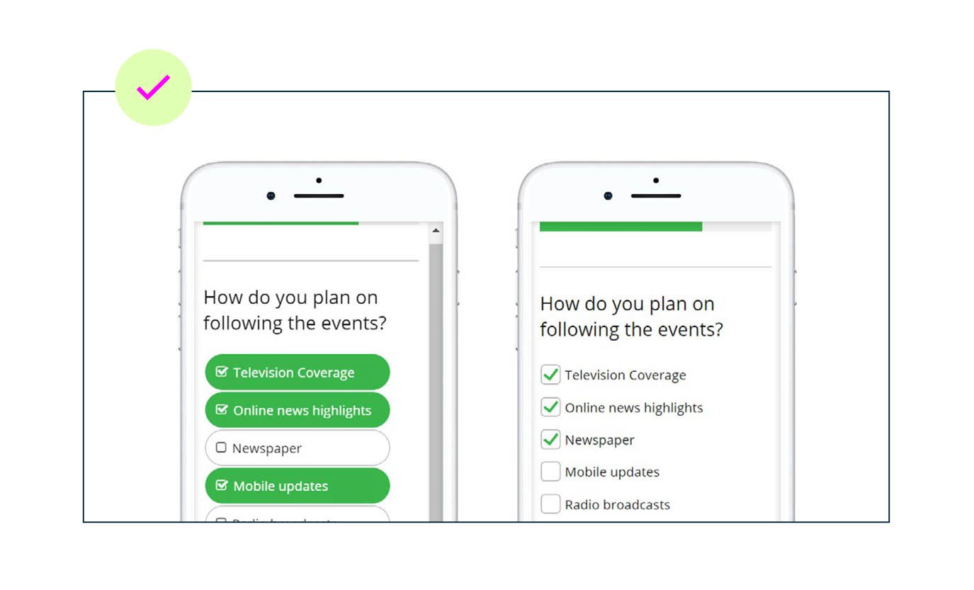
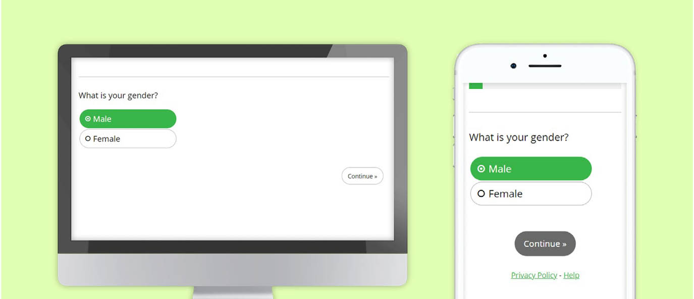
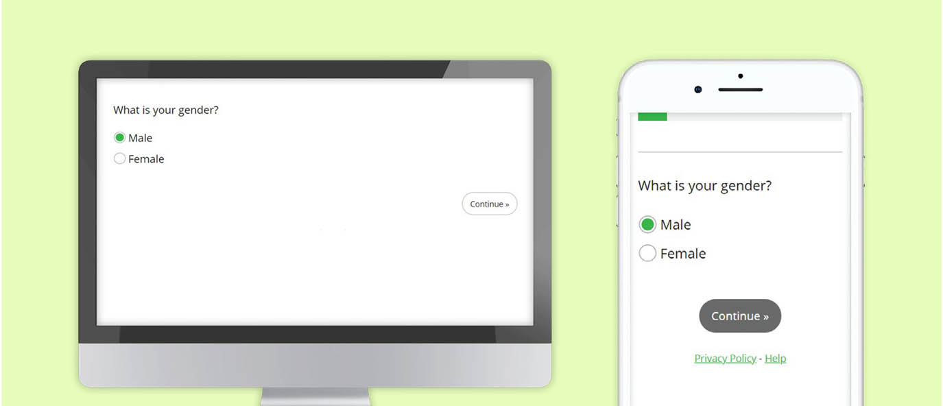
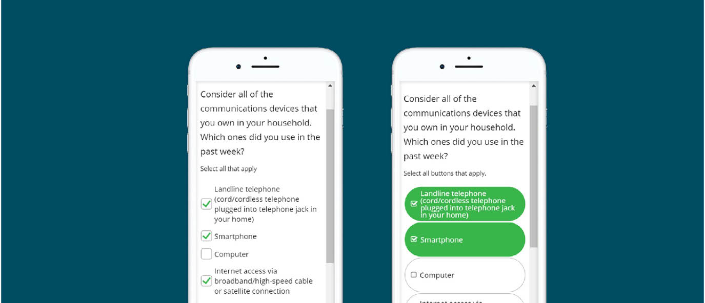
1. Make it Big
Touch input
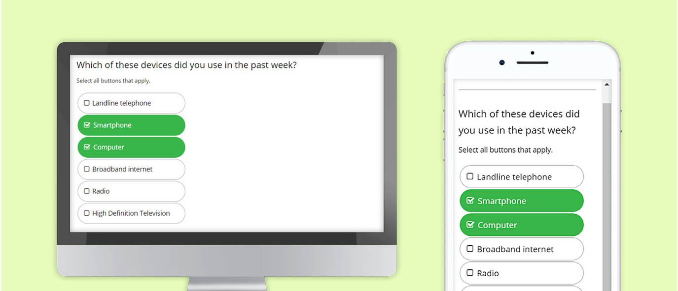
Touch input and a smaller screen are among the most defining aspects that contrast PCs and mobile devices. Therefore, ensure the selection area of a survey is large enough to accommodate the needs of touch input.
Instead, use large buttons or adjust the spacing and layout for the checkboxes. These modifications will help reduce survey dropouts among mobile users and maintain data consistency with a traditional checkbox design.
Font size
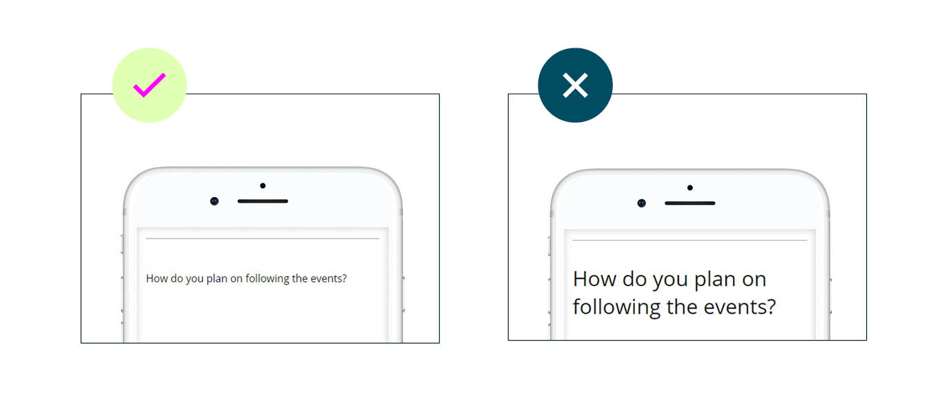
The mobile device may rescale a web page so that the content on that page fits within the viewable area of the screen. This may result in small-sized text. Therefore, ensure all text displayed is comfortable to read from a reasonable viewing distance.
By increasing the font size from 12 to 24-point in the example below, the question becomes much more readable on a mobile device. Keep font size in mind when designing mobile surveys.
2. Cut the clutter
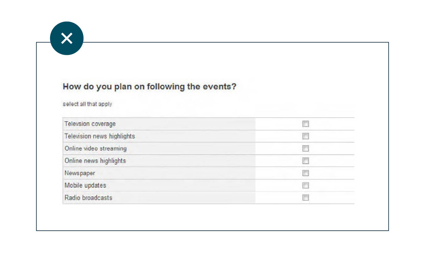
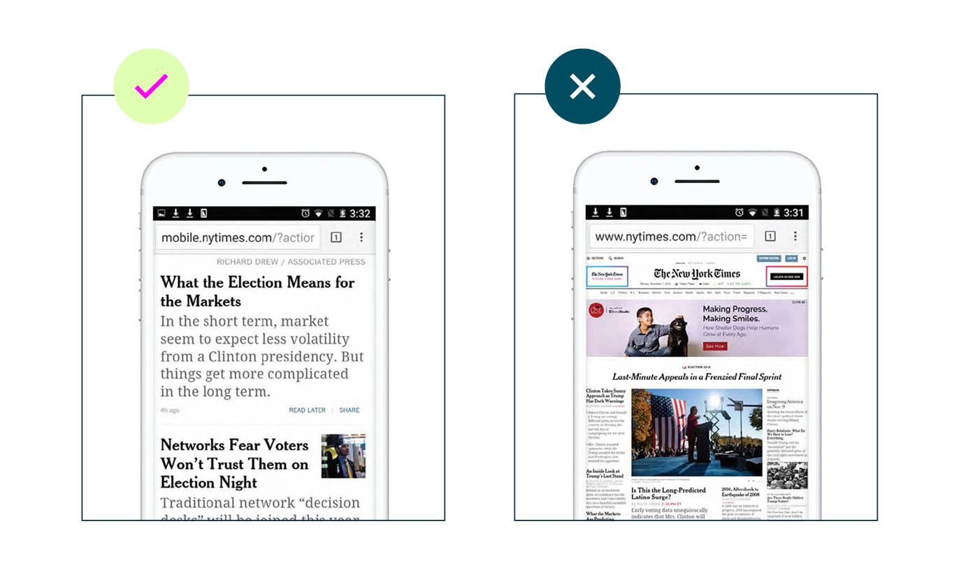
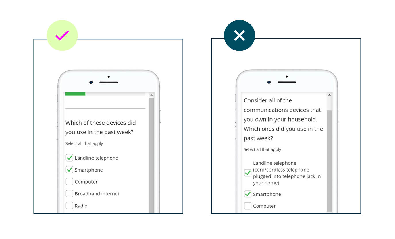
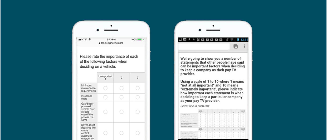
Only a limited amount of content can comfortably be accommodated within the smaller-sized screens of the mobile device. Content must be simplified to make room for increased font size and selection areas for ease of mobile use. This is quite common outside of the research realm, for instance, mobile readers of the The New York Times don’t see the full website, but a simplified and enlarged version.
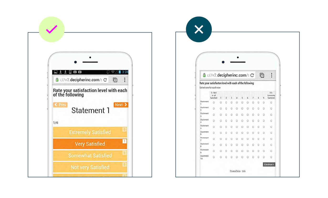
When simplifying content for mobile surveys, be sure to keep text, rows and column lengths to a minimum. Strip out any unnecessary graphics so you can enlarge pertinent content for better reading and increased survey engagement. Below is an extreme case of too much content on a mobile screen. Instead, shrink the number of rating scale points to reduce input requirements. An interactive questions can be a suitable alternative, such as a card sort question type (more on this later).
When considering how much content to cut, strive for these goals:
- Minimize the amount of scrolling required. Vertical scrolling is acceptable, horizontal scrolling is not.
- Input areas and font sizes should be large enough so that the user doesn’t have to zoom in to properly view and take the survey.
- Minimize the amount of wrap-around text.
3. Swipe & touch tap
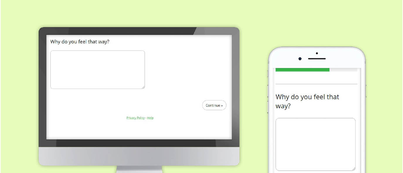
Point and click, dragging objects and typing—these are all input methods indigenous to PC use. Conversely, touch tapping and swiping are primary input methods for smartphones. As such, try to limit input requirements to these two methods when designing mobile surveys for smartphone use. Requiring other types of input is burdensome, and encourages participants to abandon surveys. For example, minimize the use of open-ends in mobile surveys. Avoid dragging or sliding events as well.
4. Survey length
The shorter the survey length the better, and it should not be longer than 15 minutes. Data quality due to participant fatigue starts to set in within the first few minutes of a survey, but signs of ‘satisficing’ becomes especially pronounced after the 15 minute mark (8). ‘Satisficing’ means to just do enough to get through the task at hand. Rather than providing thoughtful answers, participants do the minimum required to complete the survey.
This includes:
- Not answering optional questions
- Fewer characters typed in for open-ended questions
- Spending less time reading and answering questions
- More evidence of ‘cheating’ (answering in a way that allows them to skip question sections)
Studies specifically looking at survey length for mobile users have also suggested a similar 10–15 minutes maximum range (9).
5. Test and re-test
The only way to completely ensure that participants will have effective survey experiences is through direct and repeated testing. Every researcher should get into the habit of testing and taking their own surveys. This helps to pinpoint what may encourage participants to complete or drop out of a survey. Experimental evidence is not needed to identify where the text is too small, or where input areas may be difficult to manage. If a survey experience is not good for the researcher, it won’t be good for participants either. So, take a little time and make the survey more successful by personally testing them.
Test a variety of operating systems and browsers on each of the three main devices (desktop, tablet, smartphones) to ensure the survey renders properly on each. The following browsers and operating systems have the largest usage share:

Multi-platform software testing services, such as Perfecto Mobile and Keynote are available to check survey compatibility on different devices, operating systems, screen resolutions and browsers. Be sure to check for:
- Readability: Are all questions and answer options easy to read and understand? Verify text size is readable, and ensure no labels are cut off. If there is too much wrap-around text on the mobile version of the survey, simplify the question wording. If using button select questions, ensure proper color contrast (between background and the scale label).
- Usability: Do input forms work properly? Are they properly spaced and sized to be “thumb input” friendly? Don’t forget to check that input forms are properly spaced and sized for desktop as well. Enlarging the input areas for mobile may correspondingly overinflate the input areas on the desktop screen. Ensure feedback is provided to the participant after every input event (e.g. change in color state after pressing a button), otherwise this can create confusion. The ‘hit area’ for making an answer selection should also include the entire applicable space not just within the radio button or checkbox form.
- Performance: Does it feel sluggish, do pages and content load without delay? Graphics, media elements, or style formats that add extra data bandwidth may cause survey performance to slow down or feel sluggish on a mobile device connected to a cellular network.
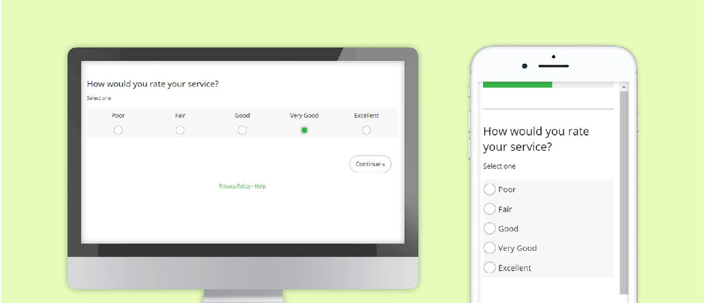
Single select and multi select question types

Radio buttons or button select forms are ideal and can render consistently across device types

Avoid lengthy wording to minimize instances of wrap-around text

Ensure ‘hit areas’ are large enough for touch input

Use proper color contrast so that scale labels stand out clearly

For button select forms, the radio button or checkbox symbol should be included in order to indicate multi or single select option

Maintain design “similarity” across devices
Categorical scales
Single select button select
Single select radio button
Multi select button select
Multi select check box
Too small. Not readable, not touch – input friendly
Poor color contrast, answer labels difficult to read
Overly wordy and too many instances of wrapping text
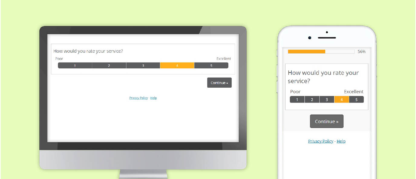
5 point horizontal scales
A 5 point horizontal scale may need to be vertically oriented in order to fit within the viewable width of the smartphone screen. While this creates a display inconsistency between device type, research has demonstrated minimal impact on data quality in this particular case (10,11).
Button select with end point labels. If labels are not necessary for each of the scale points (only end points are labeled) then button select is a suitable option.
11 point horizontal scales
Button select with end point labels
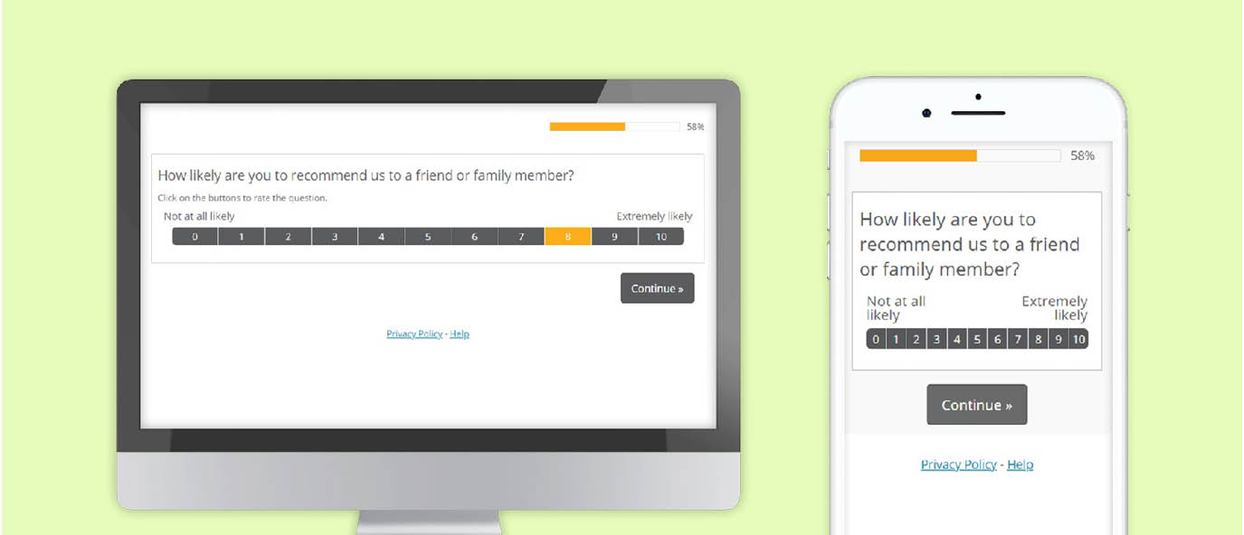
An 11 point horizontal scale will need to be vertically oriented in order to fit within the viewable width of the smartphone screen. In contrast to a 5 point scale, this display inconsistency between device type, does impact data quality. (11,12)
Grids
A traditional grid will have part of its scale cutoff or shrink down when rendered on a mobile screen
- A traditional grid isn’t appropriate for mobile survey
- These lead to increased survey dropout and inferior data quality compared to alternative options
- Use an interactive question type
Card Sort is a suitable alternative to the standard grid. It is an interactive question type that uses a static scale. When one attribute is rated, the next one slides across the screen. Card Sort outperforms the standard grid on measures of participant engagement and data quality. Despite the scale orientation discrepancy between desktop and mobile, research has shown that data consistency is maintained across devices on 5 and 11 point scales when using Card Sort (10)
Open ends
Essay
- Minimize the use of open ends as this increases dropout
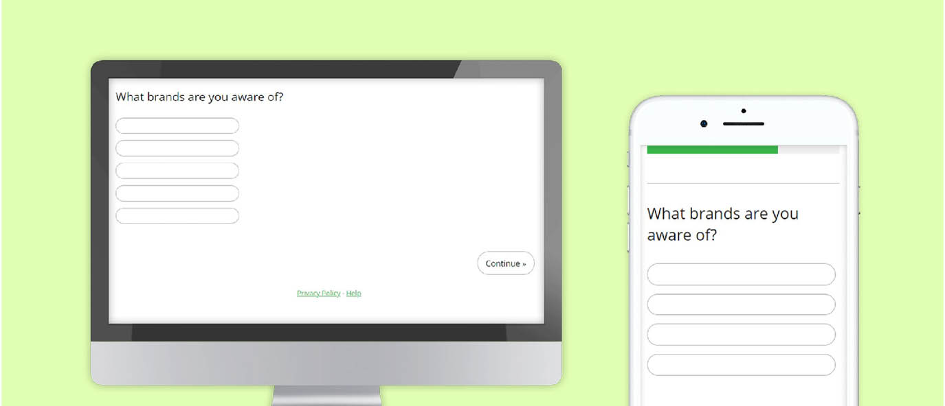
- On average, mobile users will submit three unaided items into a list of open text boxes e.g. unaided brand list (10)
Text box list
References
- Pew Research. “Smartphone, computer or tablet? 36% of Americans own all three” https://www.pewresearch.org/fact-tank/2015/11/25/ device-ownership/
- Internal statistics from Dynata, MaritzCX and Forsta
- Courtright, M., Saunders, T., Tice, J. Paper presented at 2014 CASRO Technology and Innovation Event. “Innovation in Web Data Collection: How ‘Smart’ Can I Make My Web Survey?”
- Brosnan,K., Grün, B., Dolnicar, S. 2017. “PC, Phone or Tablet?: Use, Preference and Completion Rates for Web Surveys.” International Journal of Market Research.
- Lugtig, P., Toepoel, V. (2016). The use of PCs, smartphones, and tablets in a probability-based panel survey: Effects on survey measurement error. Social Science Computer Review, 34, 78–94.
- Mavletova, A. (2013). Data quality in PC and mobile web surveys. Social Science Computer Review, 31, 725–743.
- Antoun, C., Couper, M., Conrad, F. 2017. “Effects of Mobile versus PC Web on Survey Response Quality: A Crossover Experiment in a Probability Web Panel.” Public Opinion Quarterly
- Cape, P. ARF 2015 Think Conference. “Questionnaire length, Fatigue effects and response quality: Revisited.”
- On Device Research. 2015. “30 Minute Mobile Surveys Don’t Work.” https://ondeviceresearch.com/blog/30-minutemobile-surveys-don%e2%80%99t-work
- Saunders, T., Chavez, L., Chrzan, K., Brazil, J. “Scale Orientation, Grids and Modality Effects in Mobile Web Surveys.” Presented at AAPOR 2012 Annual Conference.
- Saunders, T., Knowles, R., Tice, J. “Tipping the Scales: Best Practices for Using Scale Questions in the Mobile World.” Paper presented at IA Next 2018.
- Jue, A., Dowling, Z., Saunders, T., Knowles, R. “Mobilize Me!! – Mobile Survey Design Enhancements.” Paper presented at IA Next 2019. https://www.focusvision.com/resources/mobilize-medesign-techniques-to-improve-survey-participationand-data-quality/
Related resources
Getting the balance right for KS&R
Getting the balance right for KS&R Tools used How we helped market research firm KS&R balance keeping their tailor-made approach to research with saving their people time. The challenge Creating custom-made research despite market pressures KS&R needed more than a standard survey solution. Their research required rich customization, razor-sharp methodologies, and the flexibility to reflect real-world decision-making. Off-the-shelf […]

Seamless success: How Harris Poll delivers excellence with Research HX
Seamless success: How Harris Poll delivers excellence with Research HX Seamless success: How Harris Poll delivers excellence with Research HX Harris Poll is a trailblazer in market research, offering clients a blend of custom research, syndicated studies, and thought leadership. From brand tracking and message testing to ad effectiveness studies, their work delivers the insights […]

Everything you need to know about buying market research software
Everything you need to know about buying market research software Webinar synopsis: Tune in for a deep dive into the smartest way to evaluate, select, and secure the right research technology for your organization. We will expose the most common pitfalls, break down the key buying criteria, and show you how to build a rock-solid […]